Data visualization has become a key pillar in most companies. But not all organizations have access to analysts or complex business intelligence tools. That's where Rootlenses comes in, a platform that allows you to visualize graphical information intuitively, quickly, and without writing code.
Rootlenses has been designed so that any user, regardless of their technical experience, can obtain visual insights directly from their databases. It's no longer just about accessing the data, but also about understanding it immediately.
Step by step: how to obtain graphs with Rootlenses
Visualizing graphical data with Rootlenses is as simple as running a query in natural language. For example, you can write:
“Show me the sales by month, converting the month number to its corresponding name,”
and the system will automatically generate a clear graph, ready for analysis.
Let's see the process:
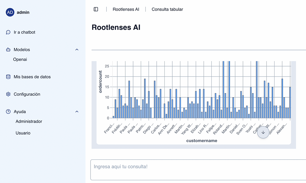
1. Select the query type: You can choose a tabular query if you want to see data in table format or a natural query if you prefer to write what you need to know in simple language.
2. Form your query:Rootlenses interprets what you write and translates it into a data extraction from your database. If the information can be represented graphically, the tool will do so automatically.
3. Choose the right chart type:
- Bar charts: Useful for comparing categories (such as sales by region or by product). They require one categorical (text) column and one numerical column.
- Pie charts: Ideal for displaying proportions, but only when there are up to 10 categories.
- Line charts: Perfect for showing trends over time, combining dates and numerical values.
Effective visualization and analysis in seconds
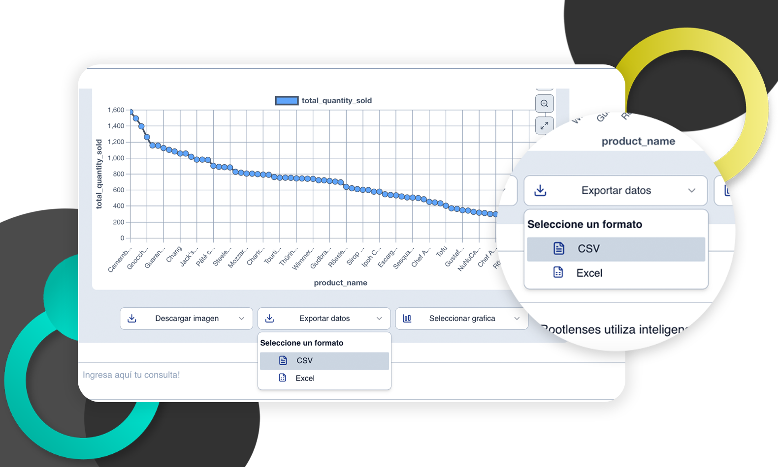
One of the great advantages of Rootlenses is that you can download the generated graphs to share with your team or incorporate them into presentations. You can also export the data in formats like Excel or CSV if you need to work with them in other tools.
This ability to transform text into graphics and actionable results in just seconds makes Rootlenses a very powerful visual analytics platform, especially for sales, marketing, operations, and management teams.
Best practices when visualizing data in Rootlenses
To get the best visual results, keep the following in mind:
- Make sure you write clear and specific queries.
- Avoid mistakes such as requesting charts with poorly grouped data or columns that don't match.
- Use terms like "by quarter," "by category," or "convert months to text" to improve visual accuracy.
With Rootlenses, data visualization is no longer a task exclusive to the technical department. Now, any user can generate useful, clear, and attractive charts with a simple natural language query.
It is a tool that democratizes access to visual data analysis, accelerates decision-making, and improves business understanding.